| Click
on picture to see it enlarged |
Karen's comments: |
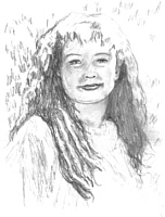 |
This is a portrait of a friend I am
working on. This is the pencil stage where I work out the layout and
values of the drawing. Her eyes are a little off here and her face
is a touch too wide... something I'll have to fix in the color
version. |
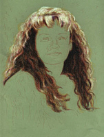 |
I started with the hair because that's
where the darkest darks and the lightest lights will end up being. |
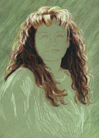 |
I refined the hair and started smudging
in my background. I also layed some highlights in for her shirt so I
know where to go with that. I'm not sure if I should darken the
background or not....need input on that. |
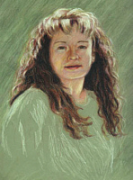 |
I couldn't stand it any
longer...I had to put in the first layers of skin tone. I know that
there is a long way to go on her face. I need to add lots of
contrast, etc, but this should give me an idea where the shadows and
highlights will fall. I would appreciate input on how this should
go. Especially in the shirt and background. -Thanks- |
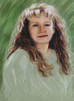 |
I darkened the background
and added more depth to her face. I still need to work on her shirt
though. |
Final Work |
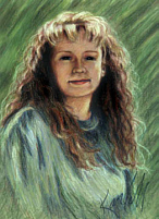
Well, I've added enough
layers now that I'm just moving the colors around and not laying any
new ones down, so I guess I'll call it done. I'm pretty pleased with
the outcome though. I decided to blend her shirt into the background
to keep the emphasis on her face. Now I just hope she likes the
drawing. :) |